Read:01 | Responsive Web Design and Floats
Article: Shay Howe’s intro to RWD & Article: All About Floats
Shay Howe’s intro to RWD
Responsive web design is building a website that will work on every device and every screen size (mobile or desktop). RWD was coined by Ethan Marcotte.
Flexible layouts
- Flexible layout is the practice of building a layout with a flexible grid that dynamically resizes to any width
- Relative length units are written as either percentages,
em, orremas values for width, margin, or padding - CSS3 introduced viewport size properties but they aren’t widely used due to lack of browser support currently
- Try to avoid fixed measurement units such as pixels or inches
- Aim to set the width of an element by dividing it by the width of its parent
- For more control and a flex layout, take advantage of
min-width,max-width,min-height, andmax-heightproperties
Media queries
- A media query is like a version of an if statement in a CSS file to determine the viewport size of the device that directs it to use one set of styles or another
- In the CSS file you’d type someting like:
@media all and (max-width: 1024px) { ... } - Media types include:
all,screen,print,tv, andbraille(the default media type isscreen) - Three logical operators available for media queries:
and(allows an extra condition),not(negate a query),only(disables styles on older browsers) - Media features identify what attributes or properties will be targeted within the media query expression
- Min/max height and width media features are used to dictate when you want specific styles to only be used on a screen that is in the declared height and width of the
@mediaquery @mediaalso has the propertyorientationwith valueslandscapeorportrait- You can specify styles to be applied to specific aspect ratios, here is an example for this property:
min-device-aspect-ratio: 16/9. (note the core property for this isaspect-ratio) - You can also specify the DPI value by using the
resolutionproperty -
Breakpoints should only be used if a website starts to look weird or the experience is bad
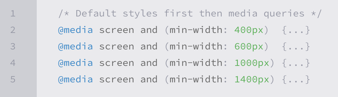
Mobile first
- Mobile first is an approach that includes using styles targeted for smaller viewports as default styles for a website, and uses media queries to add styles as the viewport grows
-
Here is an example of what mobile first media queries might look like:
- To help with identifying viewport, Apple invented the
viewportmeta tag:
<meta name="viewport" content="width=device-width">
- To control how a website is scaled, in the meta viewport tag, set the content value to something like
initial-scale=2(initial-scale should always be a positive integer between 0 and 10, the most common setting is 1) - In the meta viewport tag, set the content value to
user-scalable=yesto turn on zooming
Flexible media
- This is so that as websites are responsive to a viewport change, it allows the scalability of images, videos, and other media
- Quick way to make media scalable is to use the
max-widthproperty with a value of100%
img, video, canvas {
  max-width: 100%;
}
- BE CAREFUL:
max-widthdoes not work around iframes or embedded media like Youtube videos (Google the workaround for this, it is pretty involved)
All About Floats
- Floated elements are not absolutely positioned and remain a part of the flow of the page
- There are four values for the
floatproperty: left, right, none (default), inherit (assumes float value of parent element) - While floats can be used for layout, flexbox and grid are stronger tools for layout
- float is still good if you need text wrapping around images
- Use float instead of
position: absoluteif you want content to automatically reflow when changing the size of the element (i.e. an image element) - CSS has a property
clearwhich has four values: both, left, right, none -
An element with a
clearproperty will move itself down past the float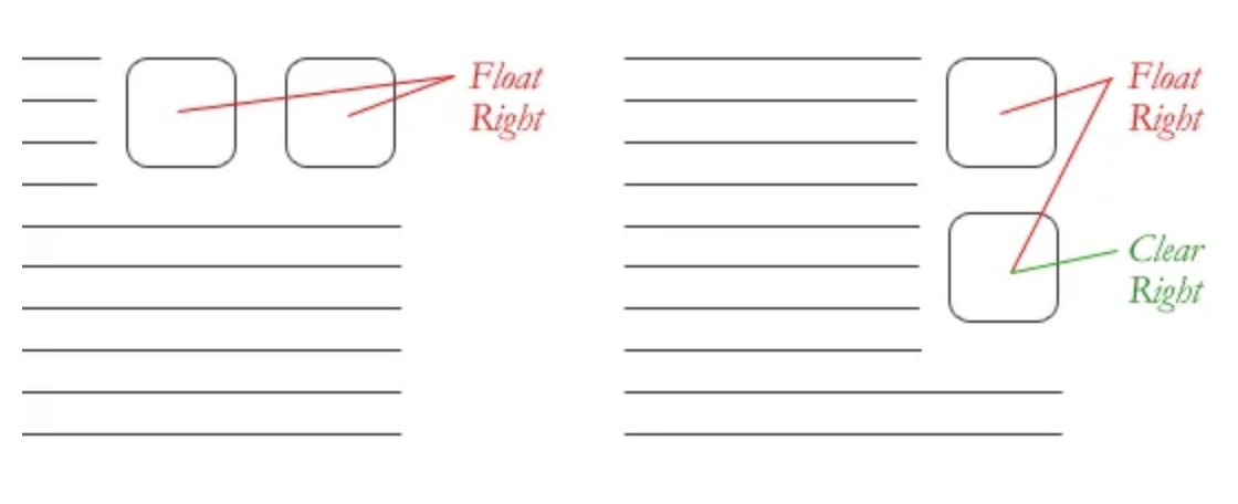
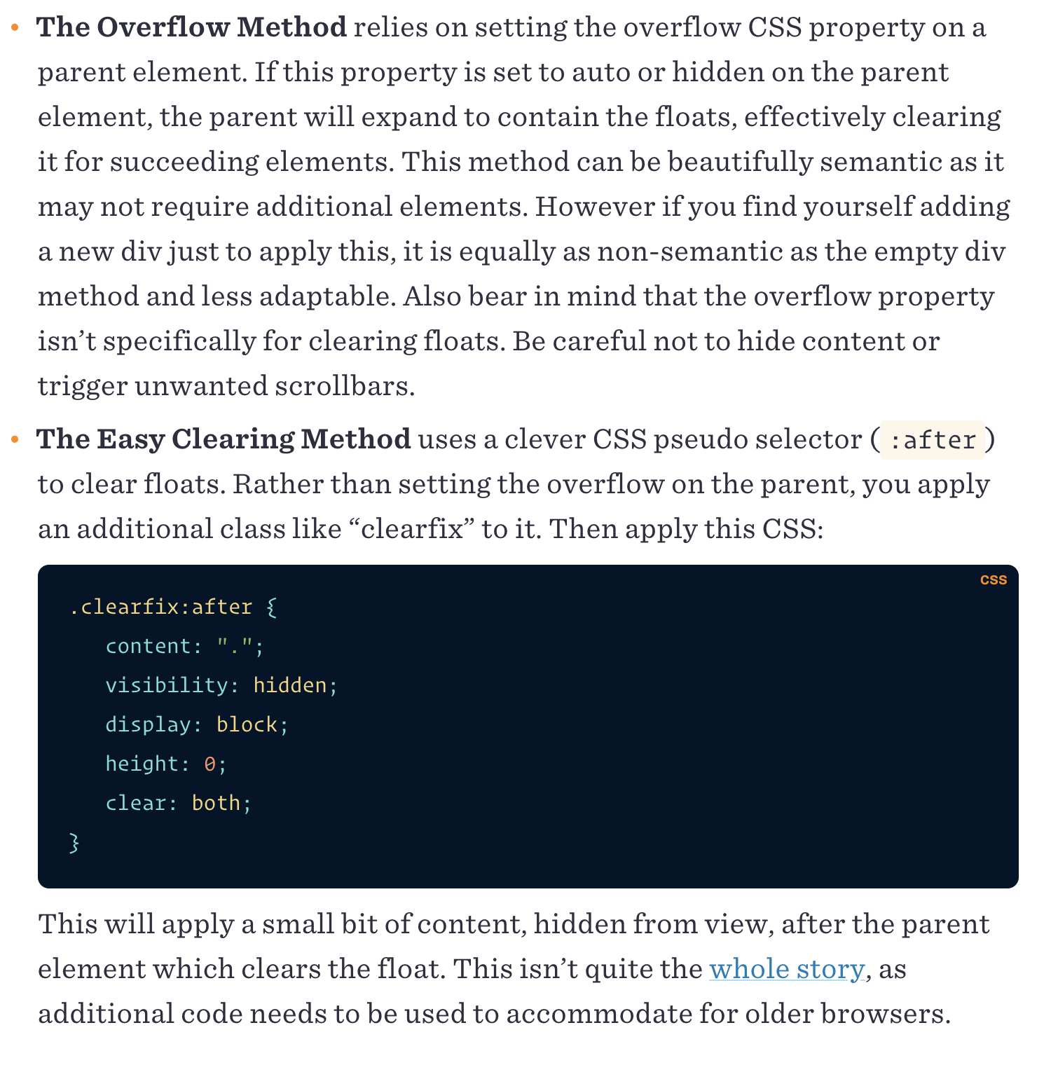
- If a parent element contains nothing but floated elements, the height will collapse to nothing
- To prevent strange layout issues, clear the float after other floated but before the end of the container
-
In an example where you would want to start a new row with several items floating to the left, you would just clear the float where you want the breakpoint to happen by using the
overflowmethod or the “easy clearing” method.